Services
- Brand Ideology
- Naming
- Visual Identity
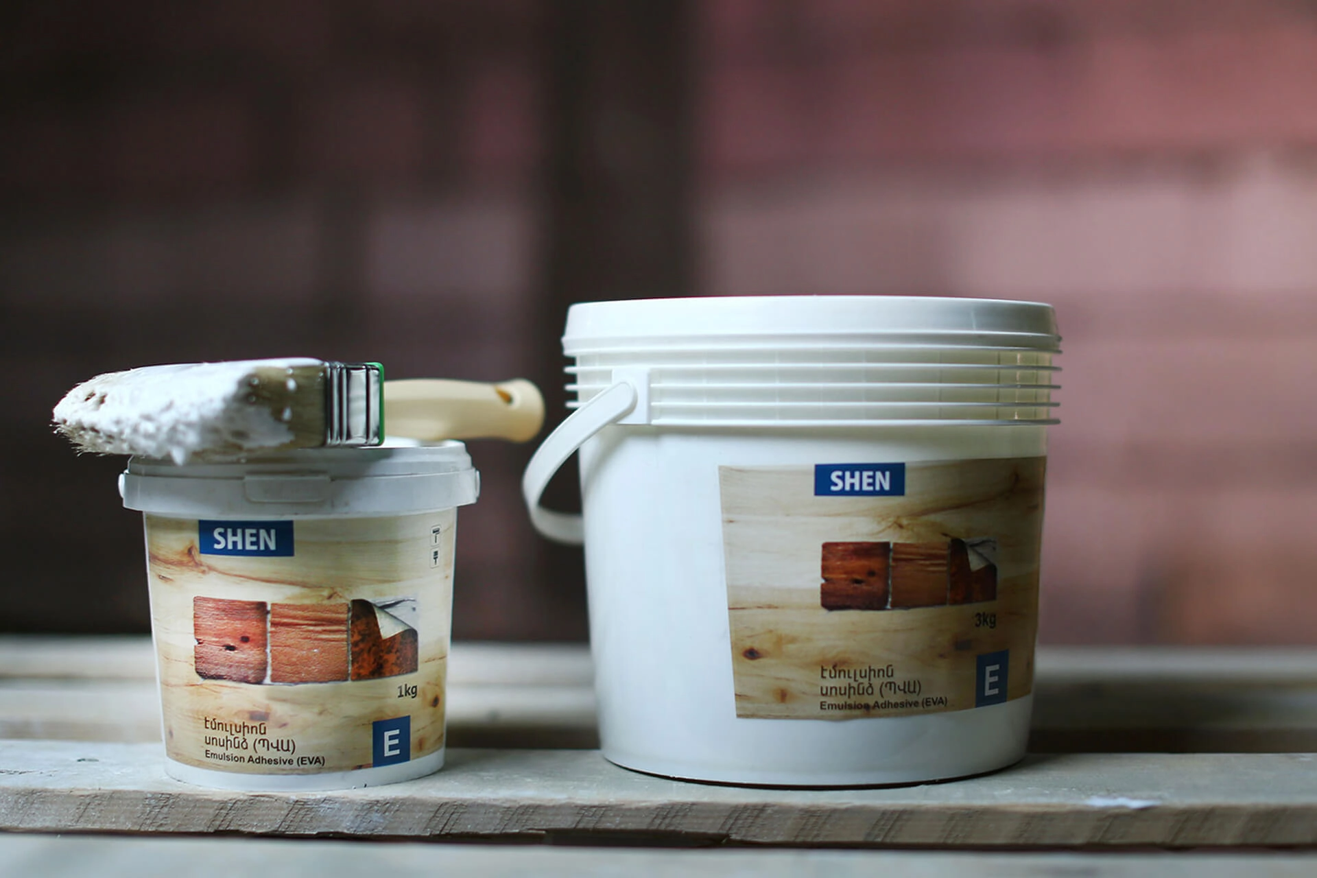
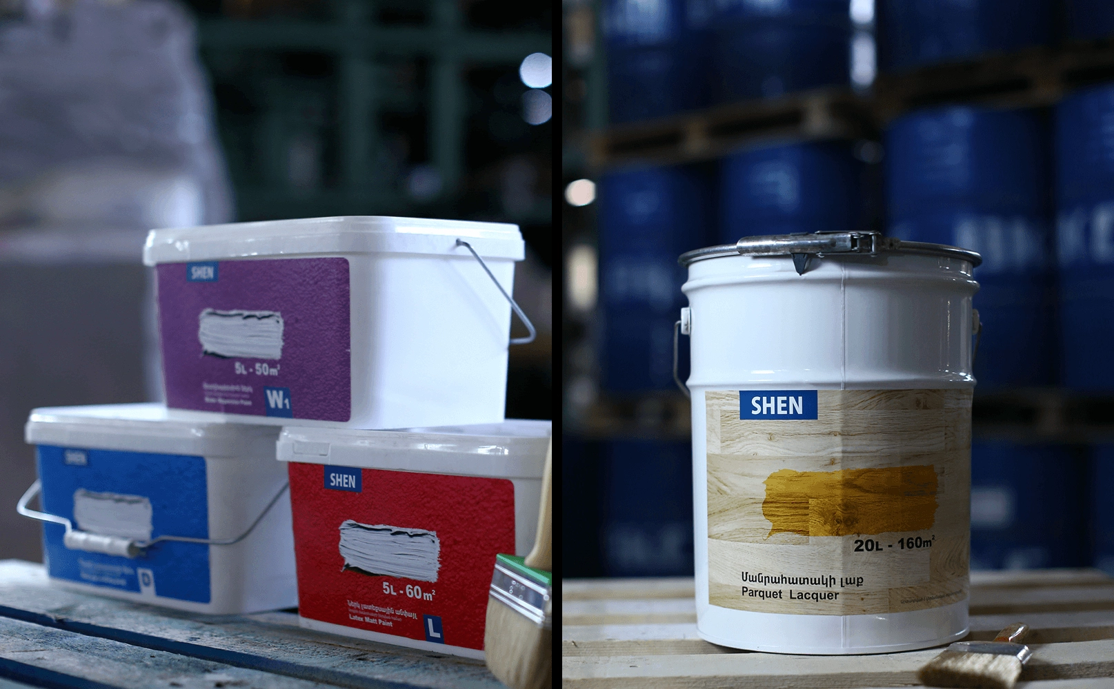
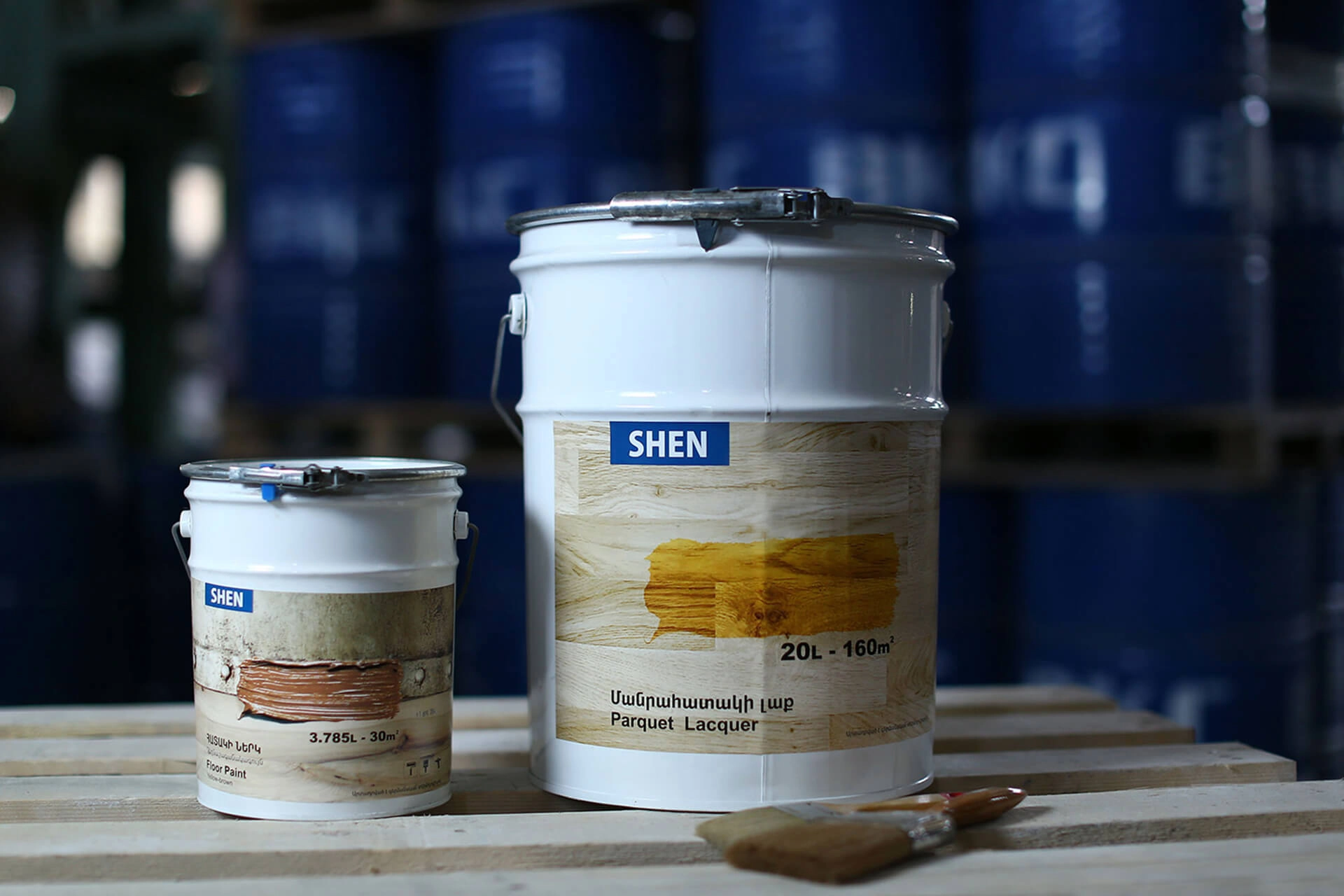
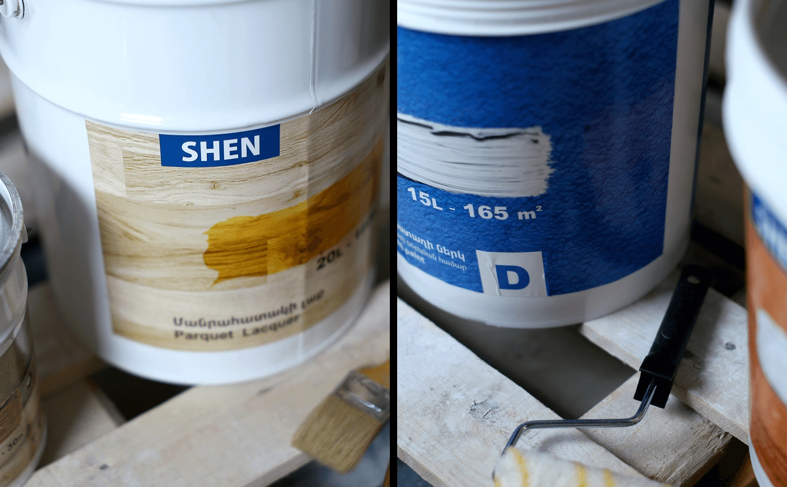
- Packaging Design
INdustry
- Retail and Product Design
Year
- 2012
Project Overview
Shen Holding Company is one of the leaders in the market of construction materials in RA, offering a wide and comprehensive list of goods and services in the sphere. Holding mines, produces and imports building materials, does professional construction and design projects, and sells a wide range of finishing products via a network of specialized boutiques.
Read MoreLess
Challenge
In 2012, Shen Concern cjsc realized the need for a consolidated brand platform and visual identity to match its intensive growth and diversification of services. A full-scale rebranding and repositioning project was launched, which also led to a partial renaming. Taking into consideration the negative associations with the word “concern” (anxiety, worry) and the fact that the company was interested in expanding outside Armenia, a strategic decision was made to change the name to Shen Holding. We started huge research, aimed to gather, analyze and audit every single brand touchpoint and communication the brand has ever used. Our goal was to crystallize things that held actual communicational value, understand what was special about them, and discard the mere embellishments. The challenge was to maintain the integrity of the existing company and find a way to highlight the autonomy of each of the branching businesses.
Answer
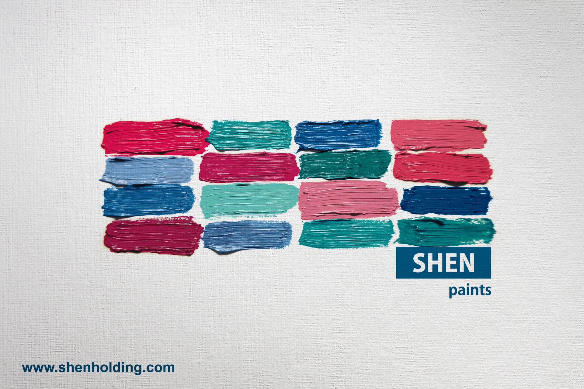
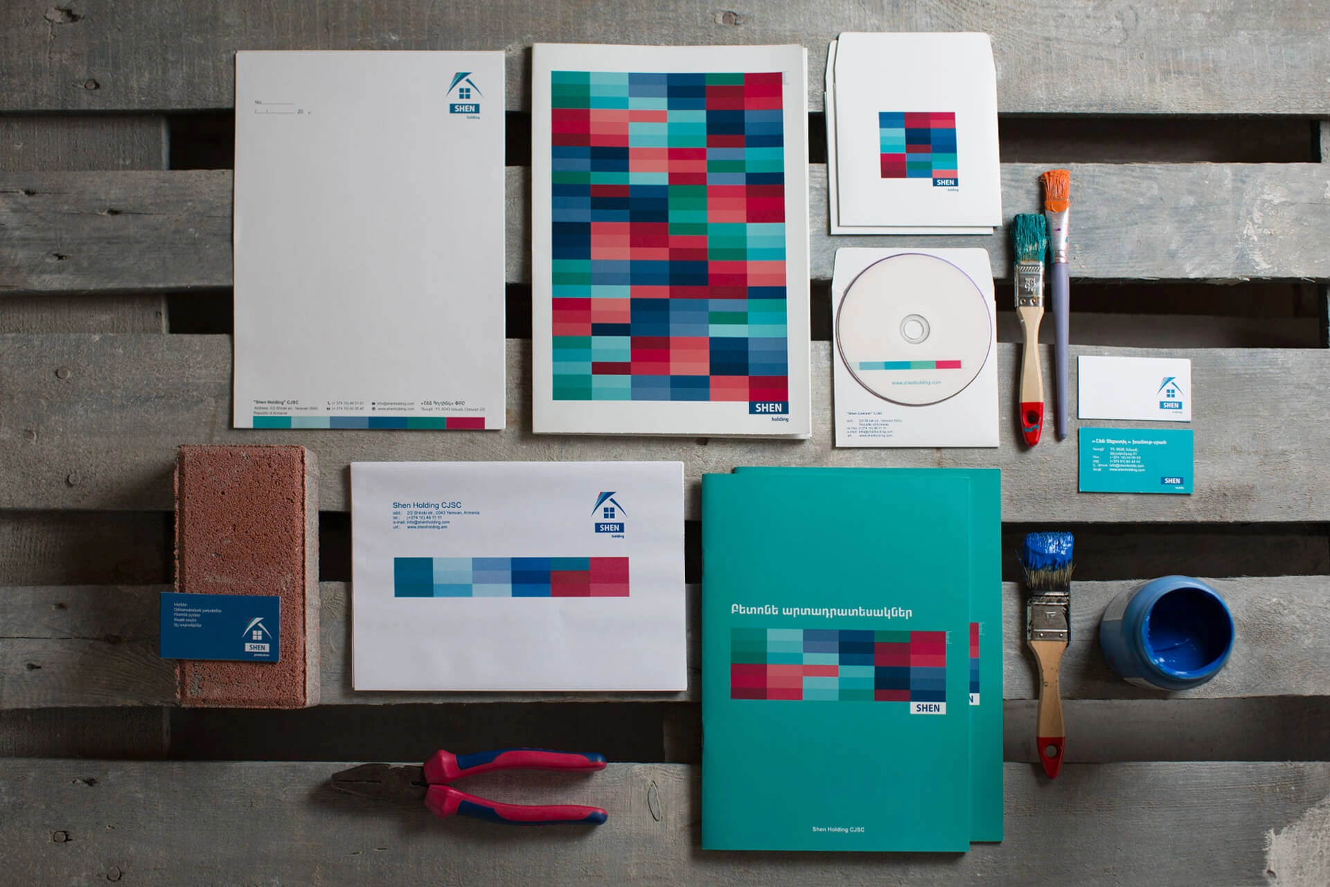
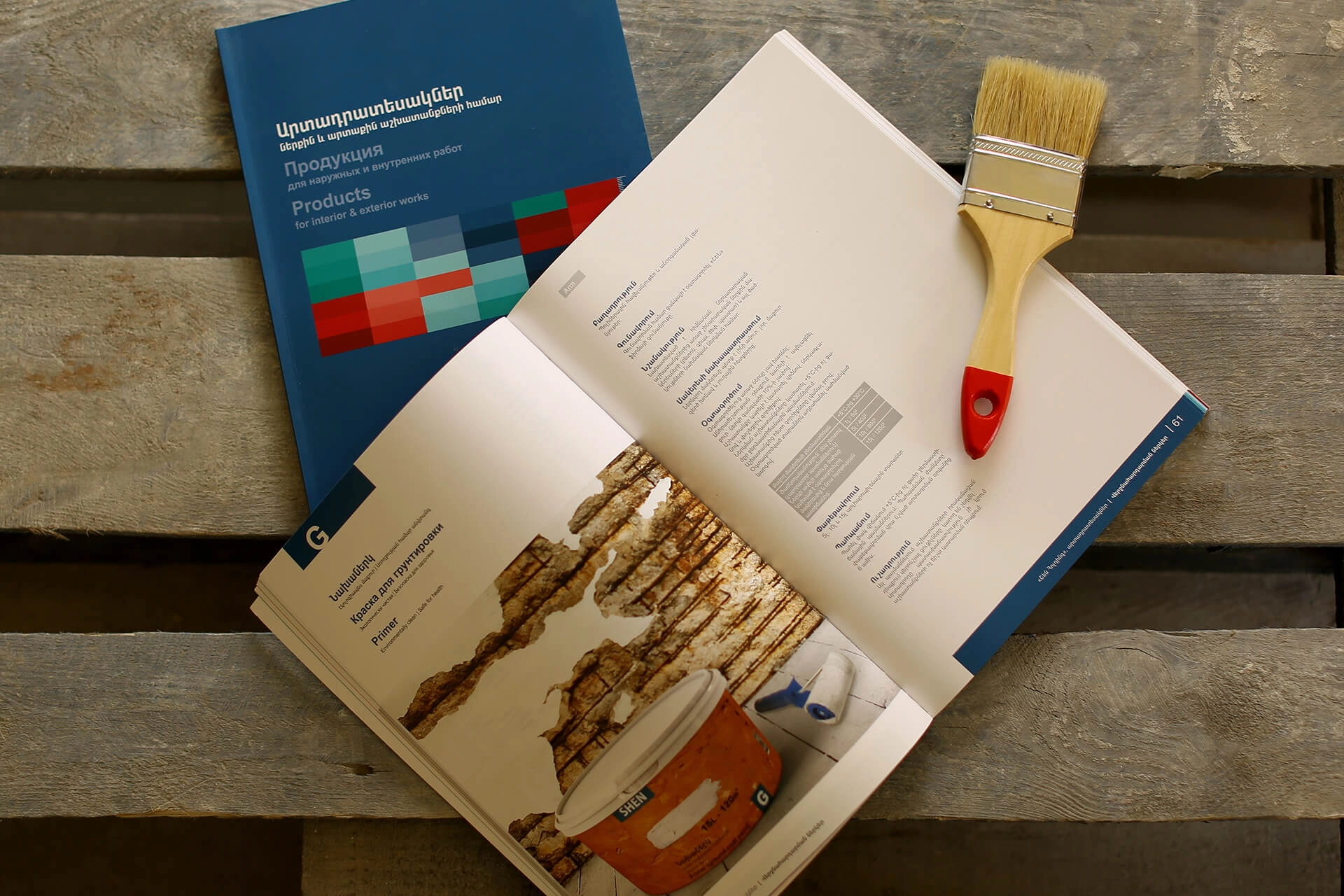
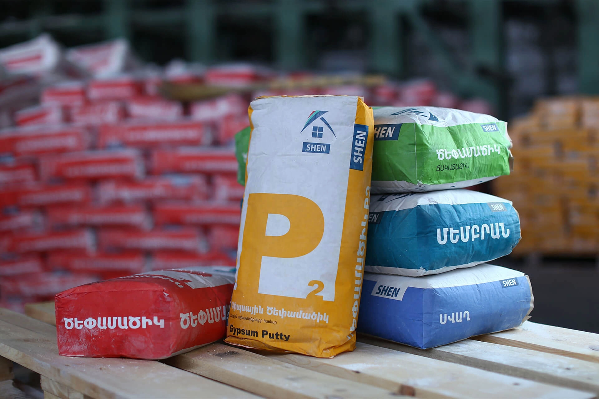
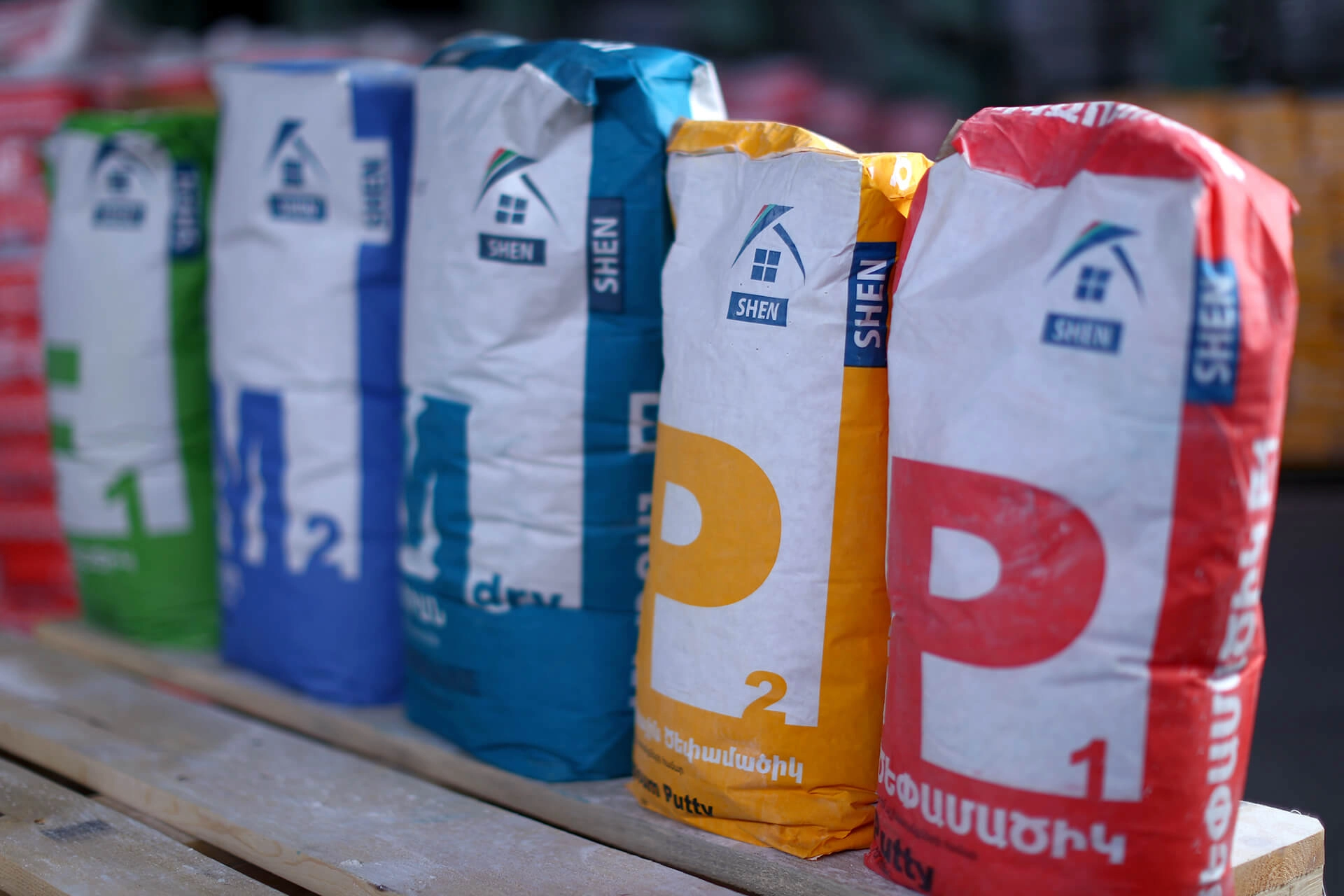
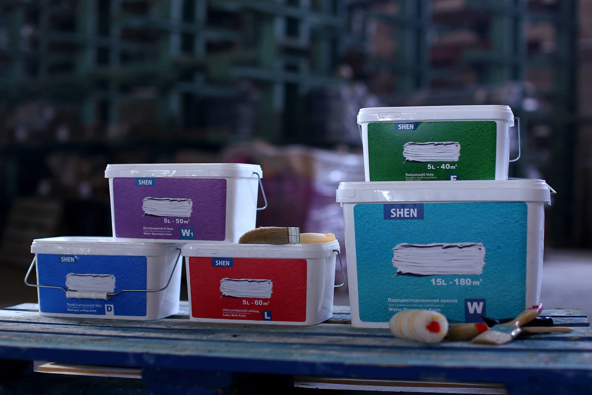
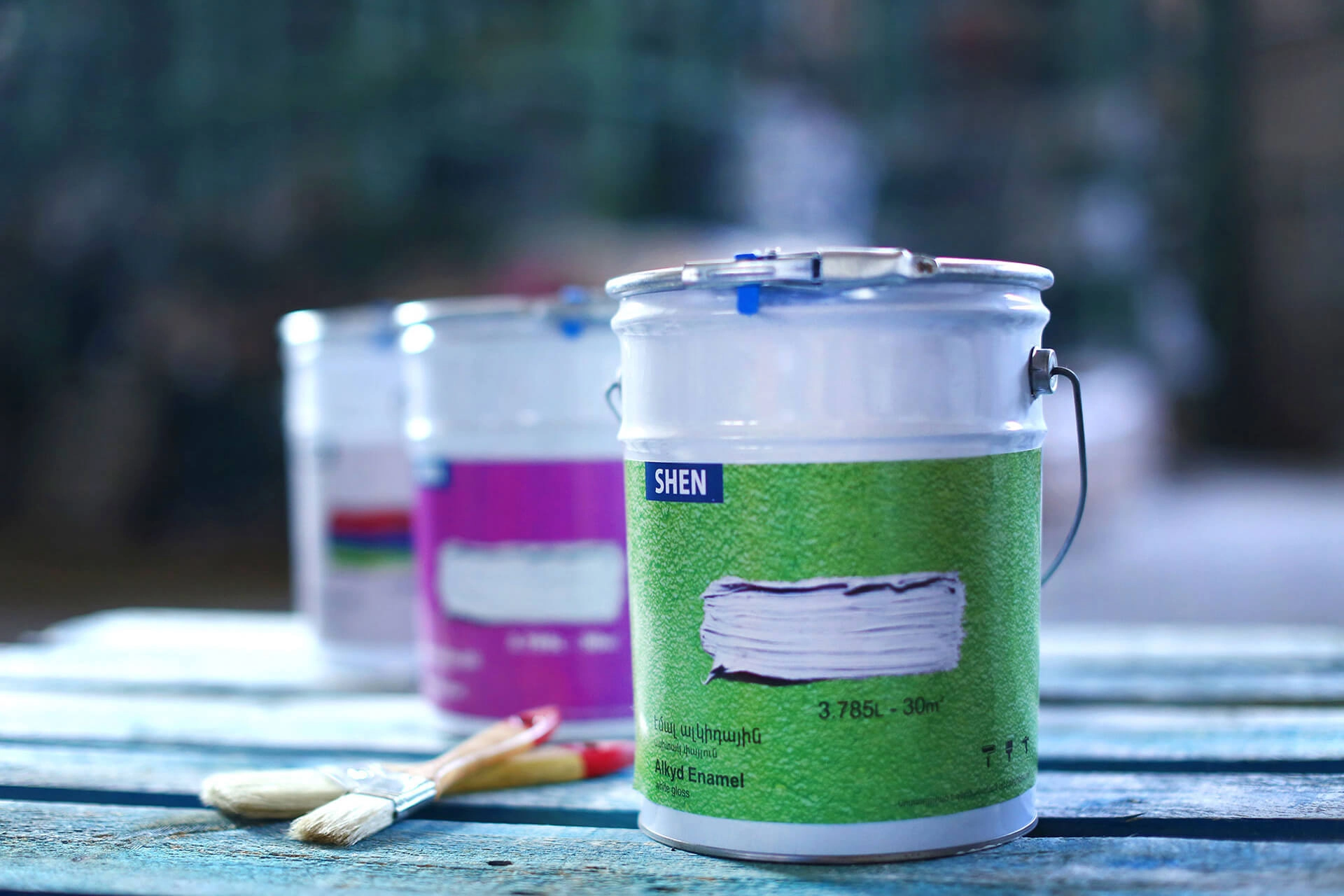
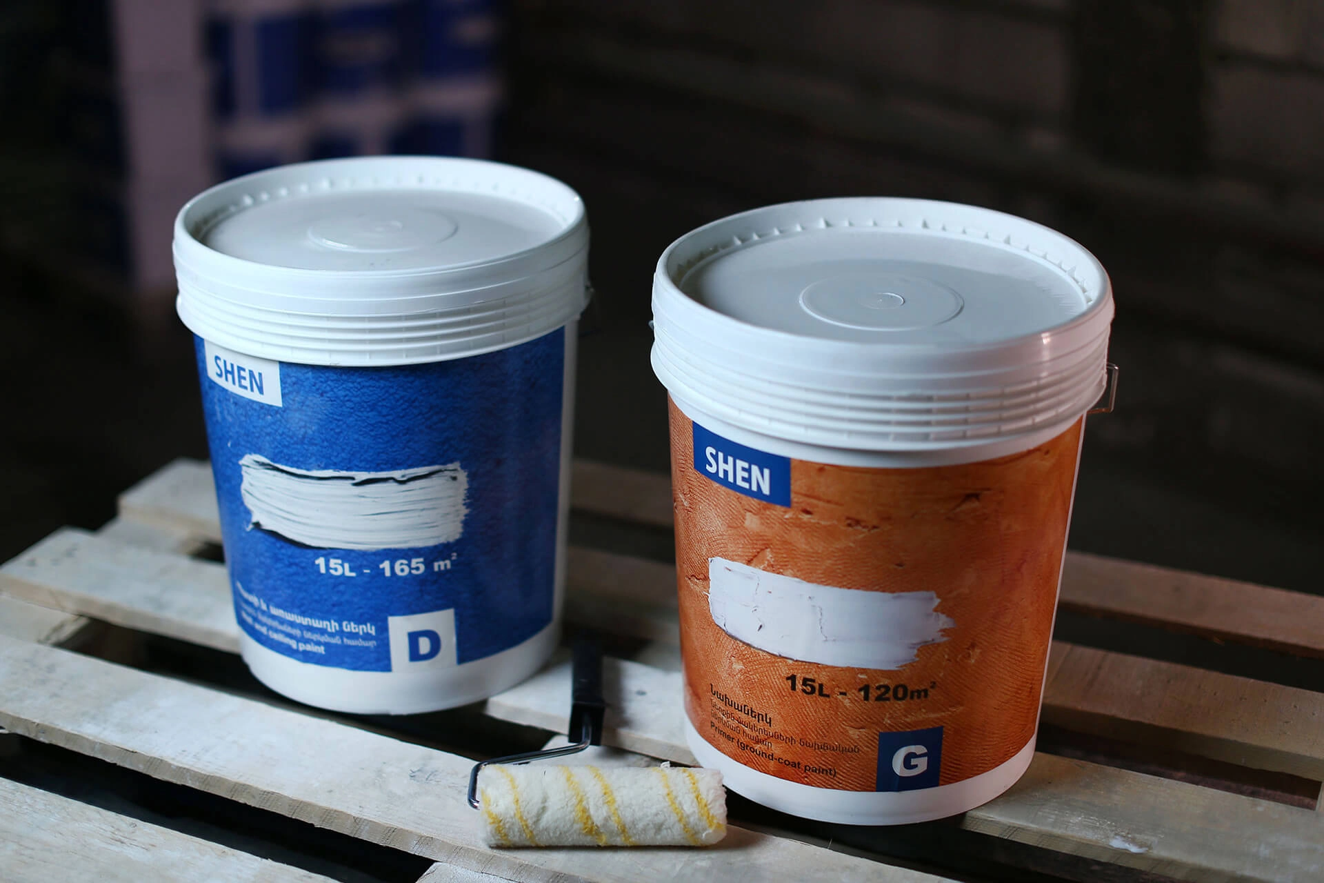
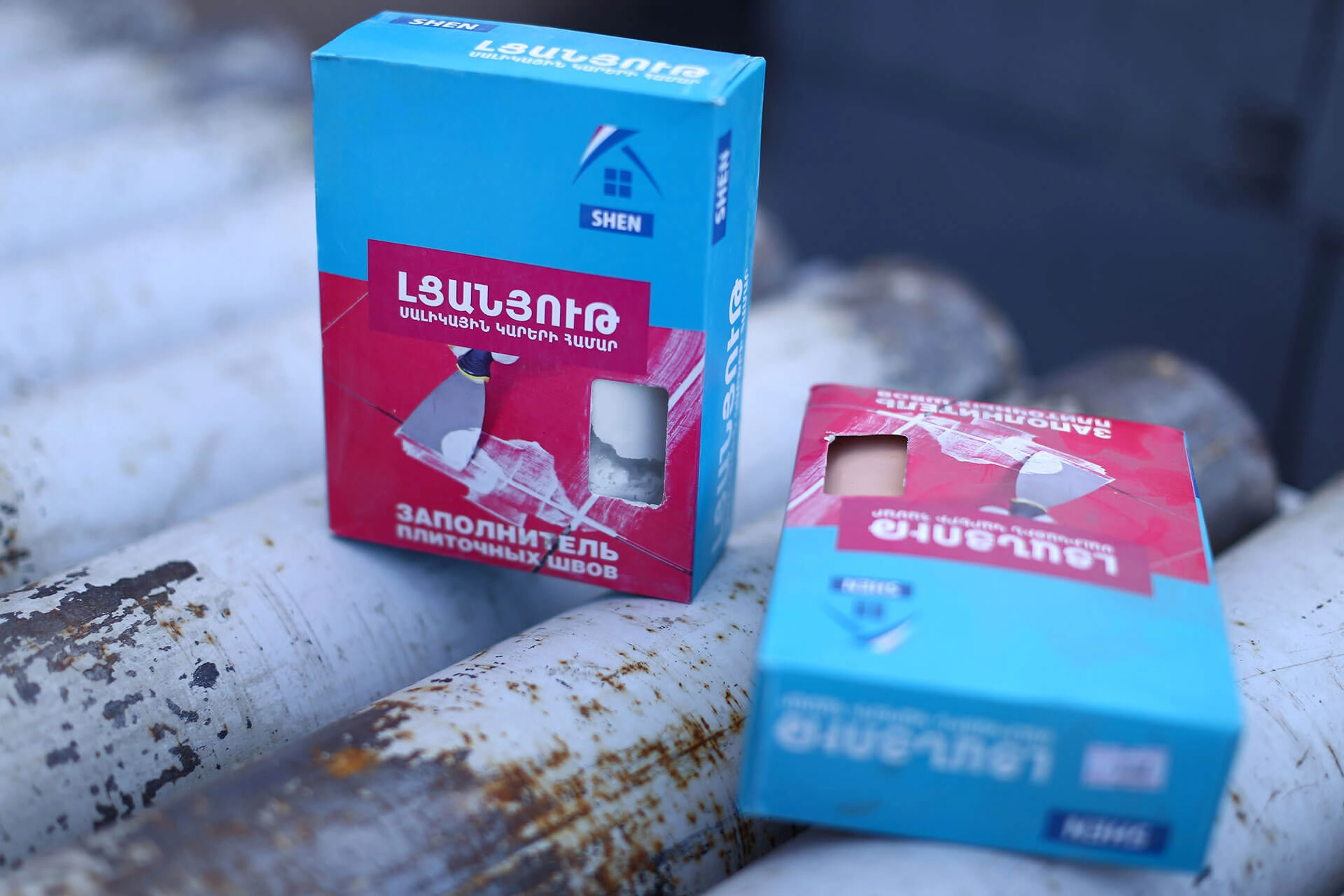
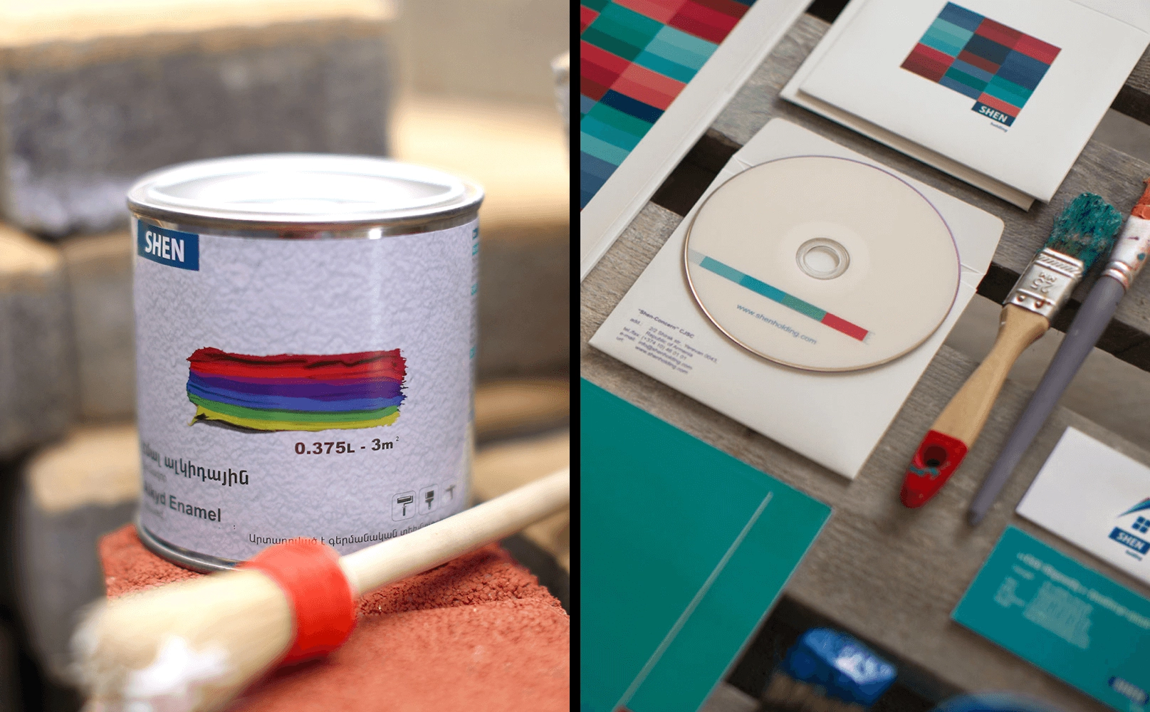
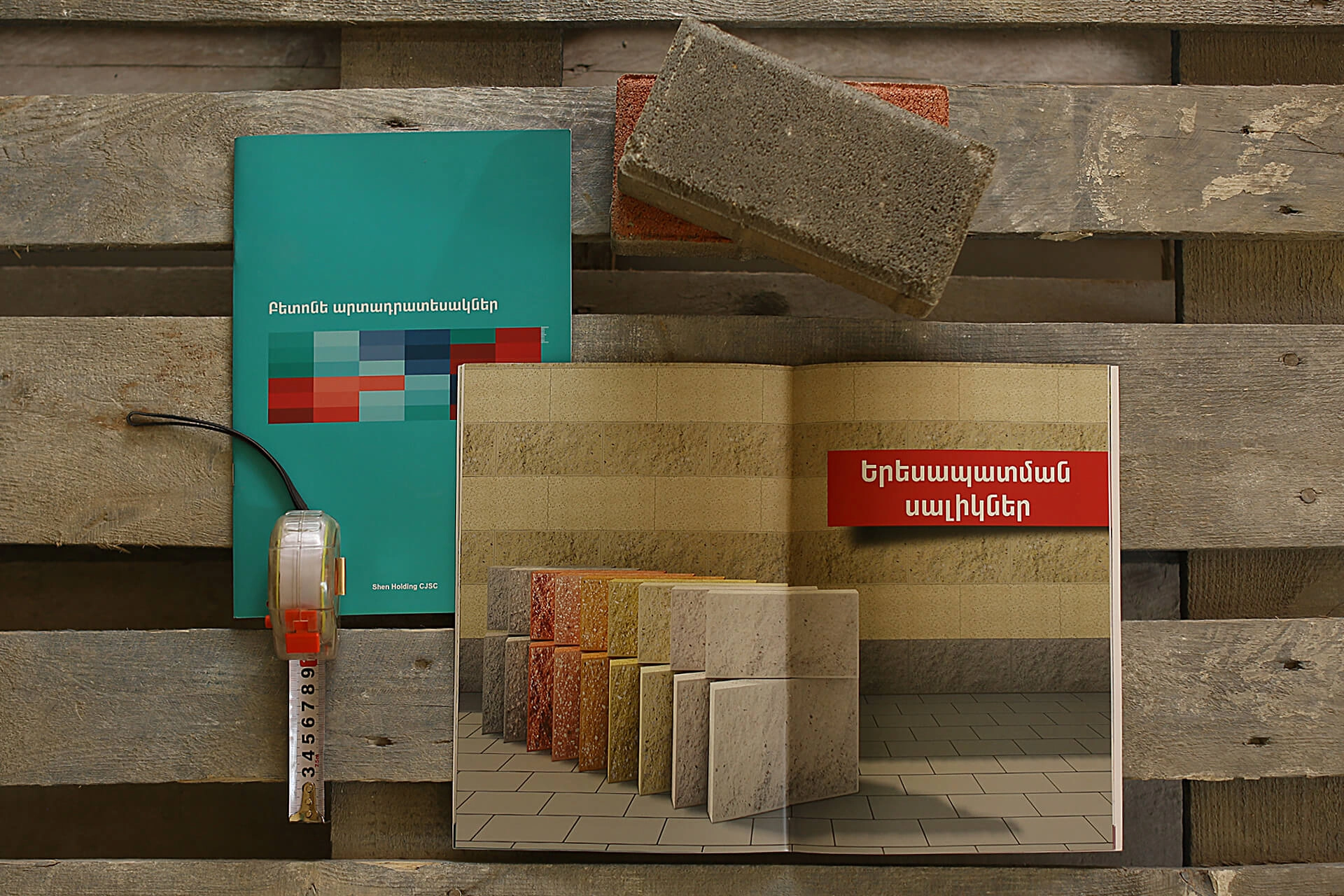
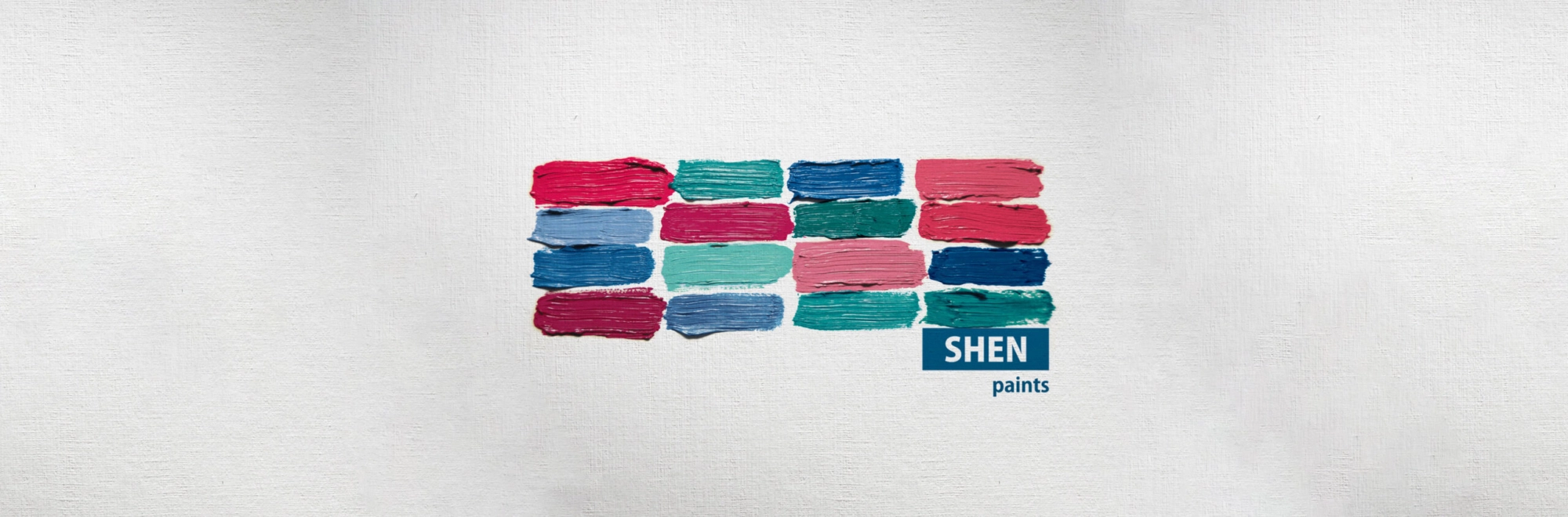
We came up with a collected, yet dynamic brand concept, that highlighted the strong, responsible, and “Armenian” character of the company. Visual style managed to support the system in which each division was independently highlighted and easily connected to the Mother Brand. The core of the brand platform is the concept of a strong and reliable base, a brick that has been visualized and used both in the restyling of the logotype and new corporate brand identity. The new brand has maintained its main philosophy of absolute reliability and stability but took it to the next level with modern design solutions and messaging. A palette of five shades was selected, where each color is “responsible” for a particular business unit in Shen Holding. The main logo is a house, composed of new corporate colors (the divisions). This rebranding project helped Shen unify its divisions and teams, become a truly national brand as well as conquer new markets.